Art done using aboriginal shapes.
Kindergarten and Grade 1 Experiences at Rosser Elementary
Art done using aboriginal shapes.
We had a very busy week (February 13-15) with our Valentines celebrations and those of the Lunar New Year.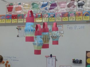 Our class performed a song (with divisions 4 and 6) and we also did a poem (What Colour Were the Dragons) on our own at the school-wide assembly.
Our lovely lanterns have been hanging in our classroom.
We enjoyed a delicious potluck luncheon. Thank you to all who donated food to our feast!
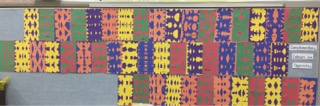
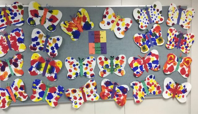
Students have been learning colour theory. They have learned about primary and secondary colours and how secondary colours are made from primary ones. They know that primary colours cannot be made from other colours.
In this activity students used construction paper panels. They cut sections out of one panel and glued it to its complementary colour – i.e. its opposite. All three panels were then glued onto a full sheet of construction paper.
These are on the bulletin board at the back of the classroom.
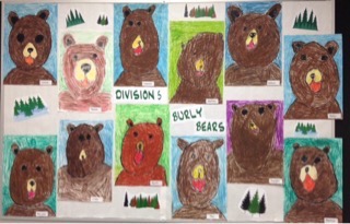
After a directed drawing lesson the students completed their pictures with oil pastels. Most have been put on the bulletin board in the Office and the rest are on the bulletin board in the hallway.
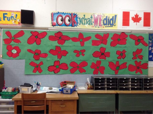
Students created beautiful poppies.
We began with a directed drawing lesson where the students drew a large poppy on white paper. They then traced these with black China markers (a type of grease pencil). The centre circle was solidly coloured in with green waxed crayons. Students then painted the petals red. This all happened on Friday. Today, when the paint was dry, students traced over their outlines, cut the poppies out, and glued them onto green construction paper.
The complementary colours (red and green) really pop when put together!
These are on the bulletin board at the back of our classroom. They look amazing!
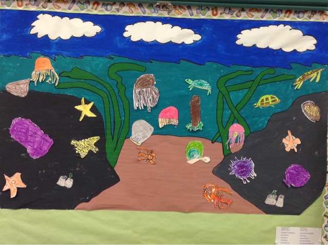
Look at the awesome mural that the students have made for our look at invertebrates which reside under the ocean waters!
Our grade twos did the painting and all students created an invertebrate creature. They first drew their creature, then they outlined them with Sharpie markers, and finally, they coloured them with oil pastels.
This mural is on a bulletin board in our classroom. Check it out if you are in the school.
Students spent some time on Friday afternoon working with a variety of construction paper, in Fall colours, to create a picture that represents the Fall season. They were only allowed glue sticks and paper.
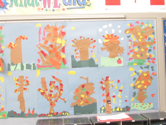

These are on the bulletin board at the back of our classroom.
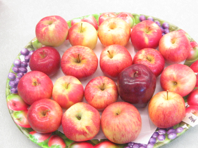
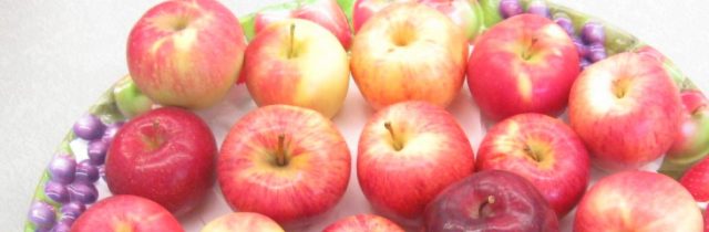
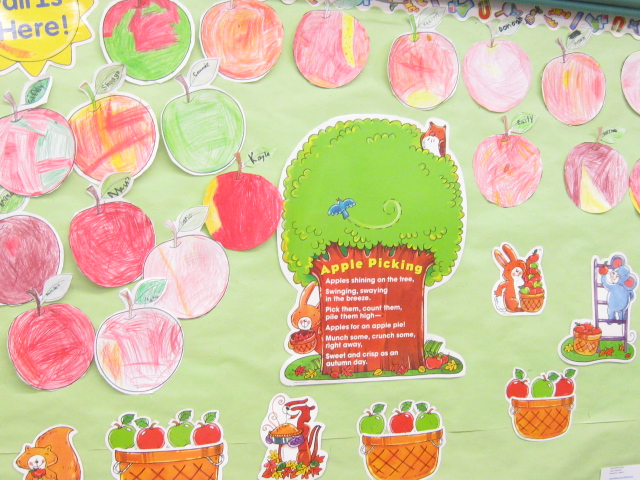
Thank you to all parents who sent in an apple for our apple explorations. Students noticed that apples came in all sorts of varieties, colours, sizes, and shapes.
Students spent some time observing their apple and then making a pictorial presentation by colouring a paper apple in as close a copy of their apple as possible.
We have looked at how the apple life cycle works:
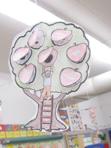
We will continue our explorations this week with the apple life cycle and how it correlates to the seasons of the year.
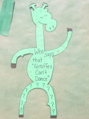
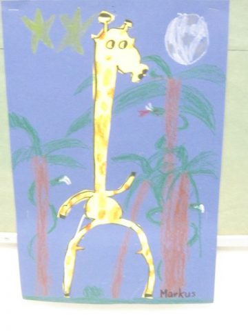
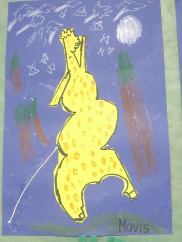
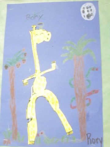
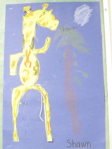
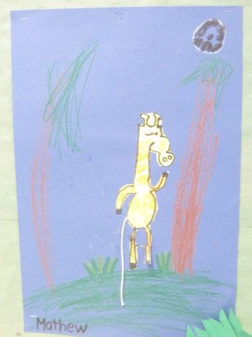
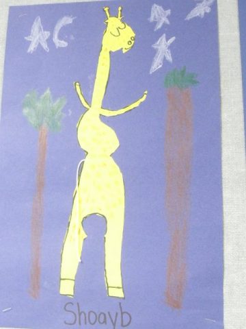
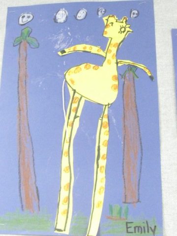
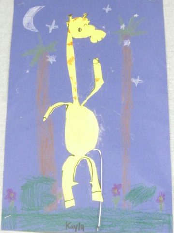
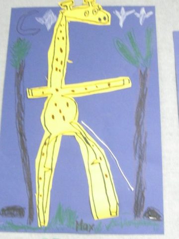
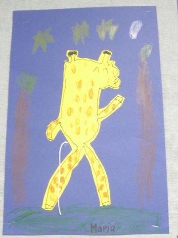
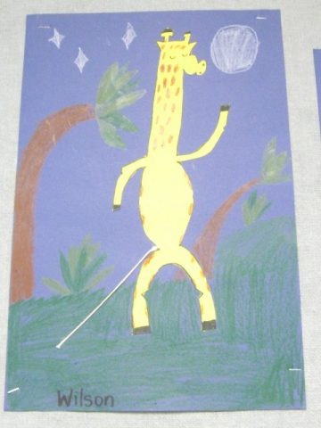
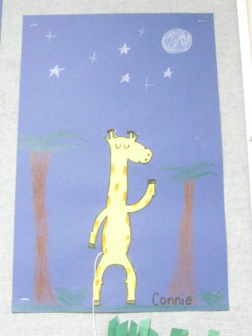
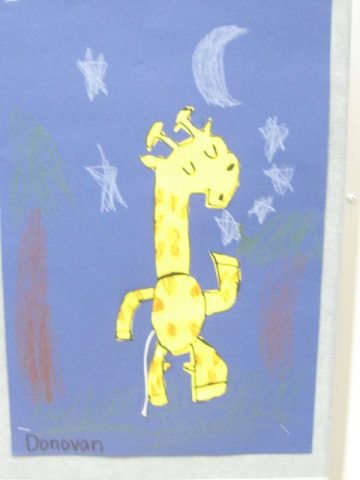
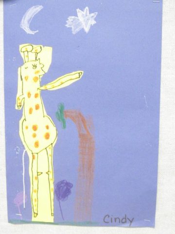
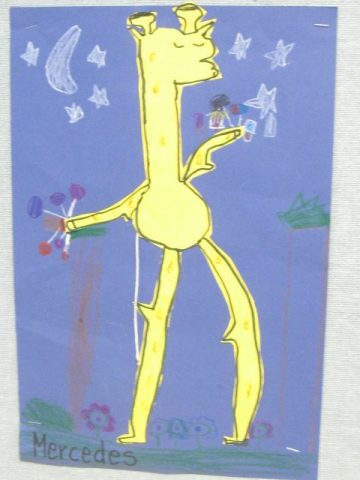
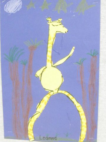
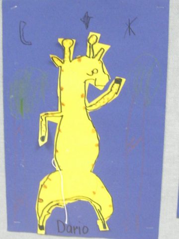
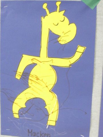
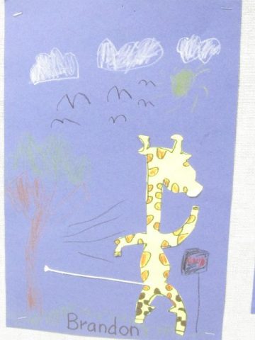
We read the story, “Giraffes Can’t Dance”, by Giles Andreae. It is a story about Gerald, a giraffe who longs to dance like everyone else but he just can’t seem to get it right because his legs are too long and skinny.
Afterwards we discussed how the cricket gave Gerald the confidence to try his best and to not give up. Gerald may not dance like everyone else does, but he does dance.
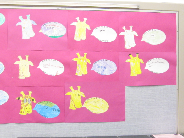
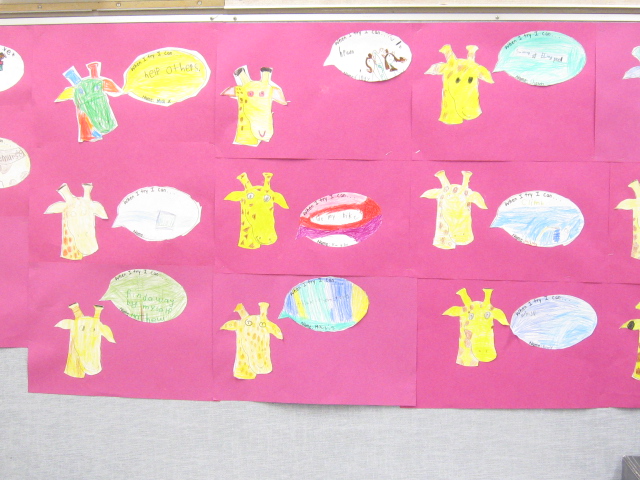
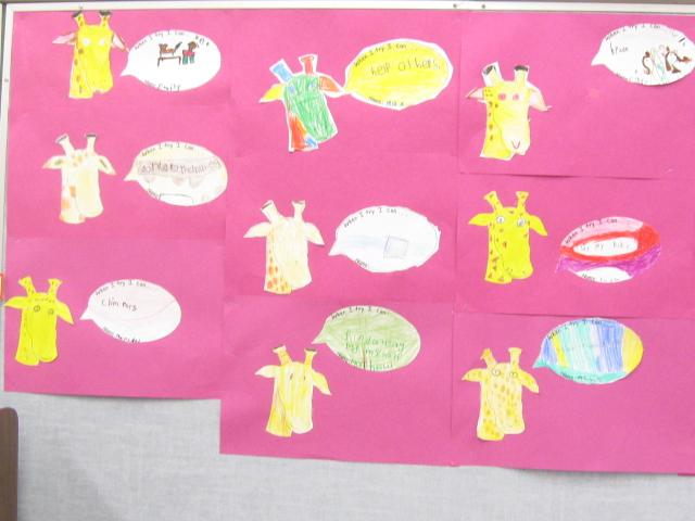
Students then thought of something that they can do if they try their best. They created talking bubbles with their ideas and put them next to a Gerald head.
We then had a directed drawing lesson on drawing Gerald dancing – firstly on a practise white paper and then onto yellow construction paper. Student added the details in black Sharpie, cut them out, and glued them onto blue construction paper. They are all very unique and individualistic with the facial expressions and the dance moves. They are on the bulletin board outside of our classroom.