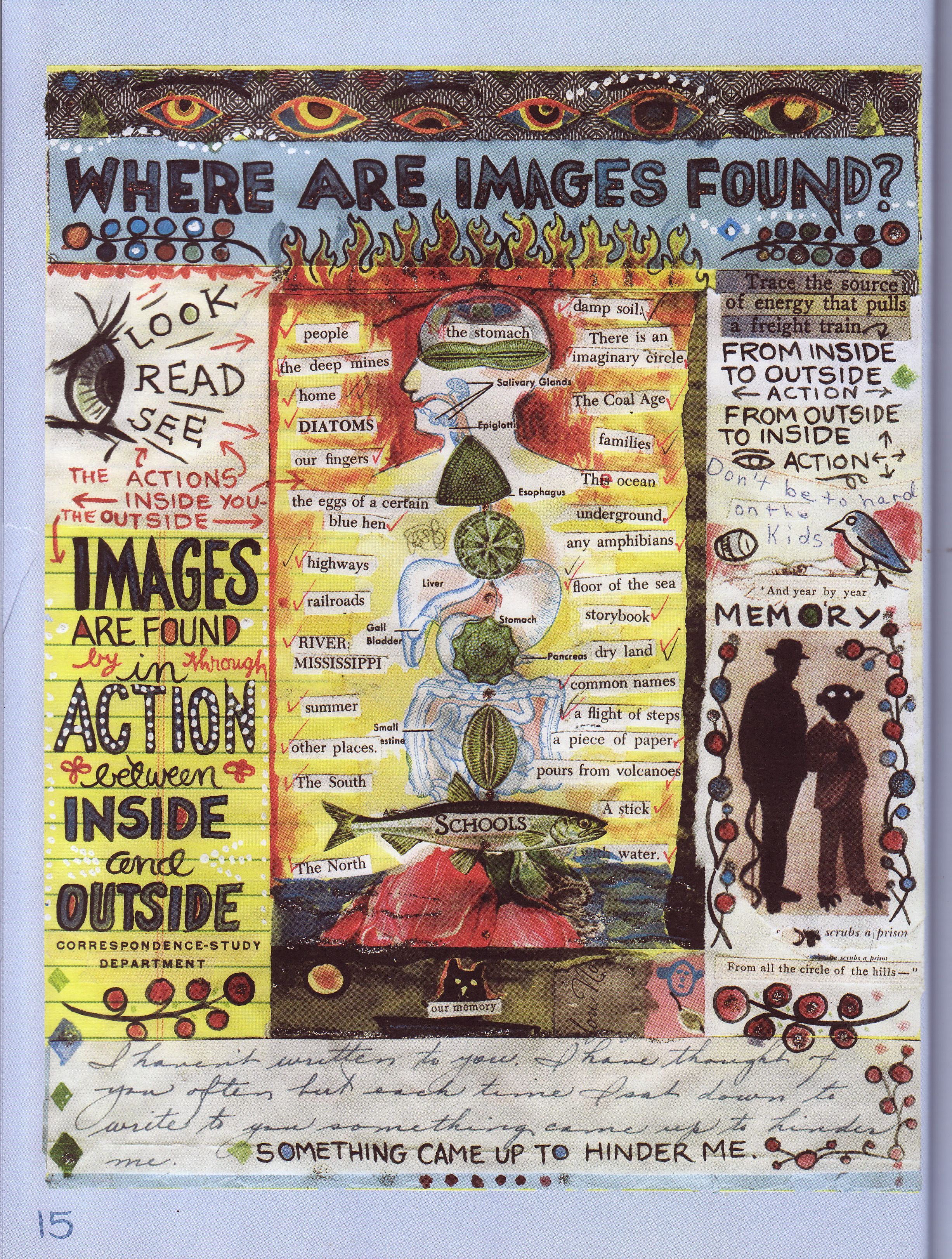
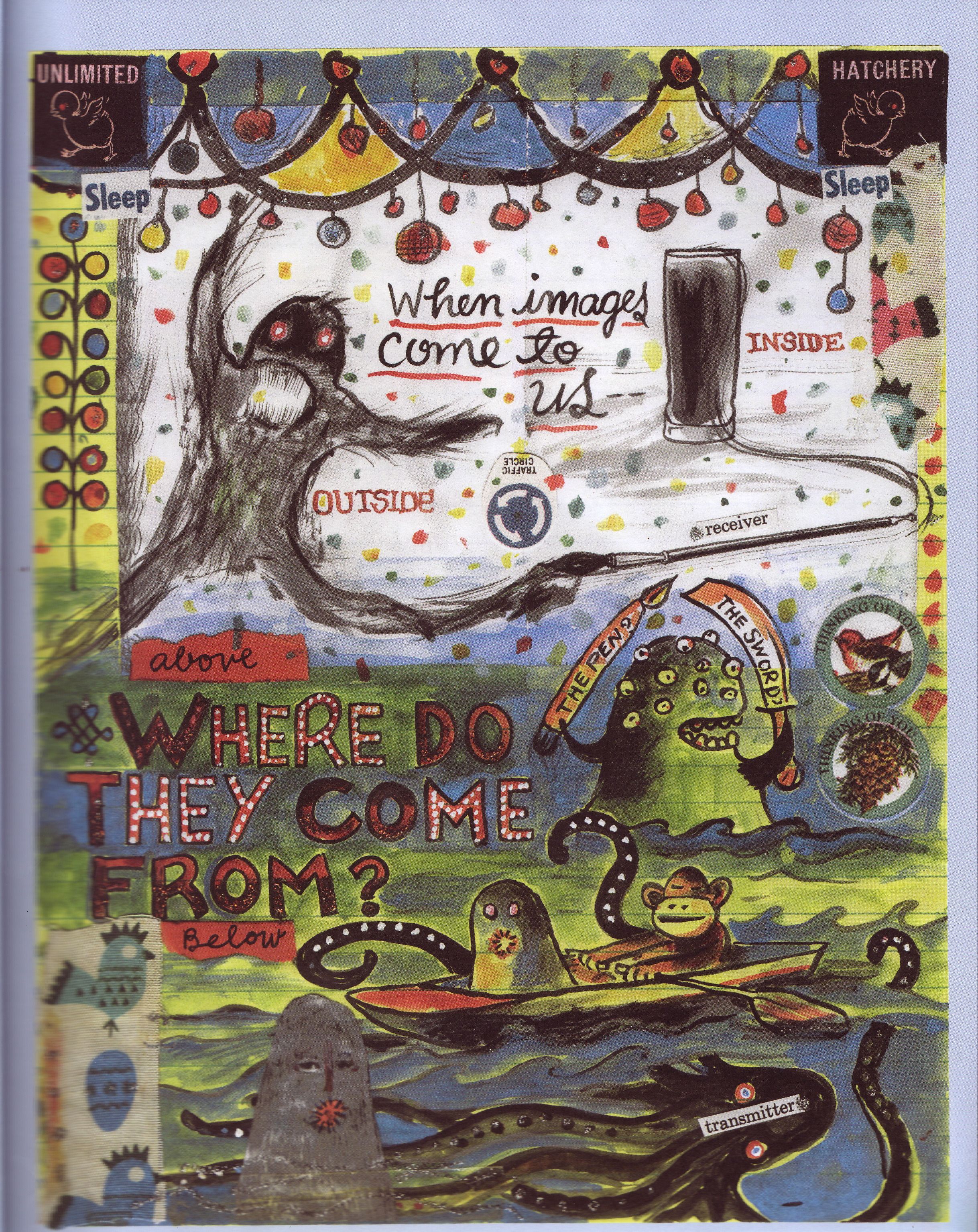
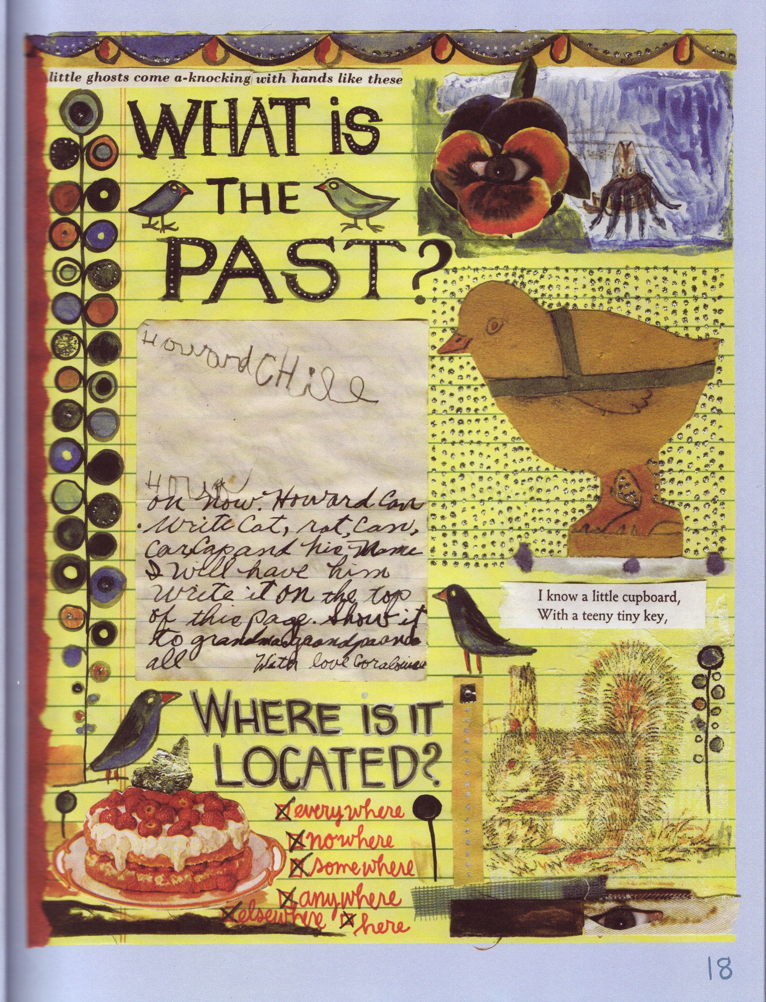
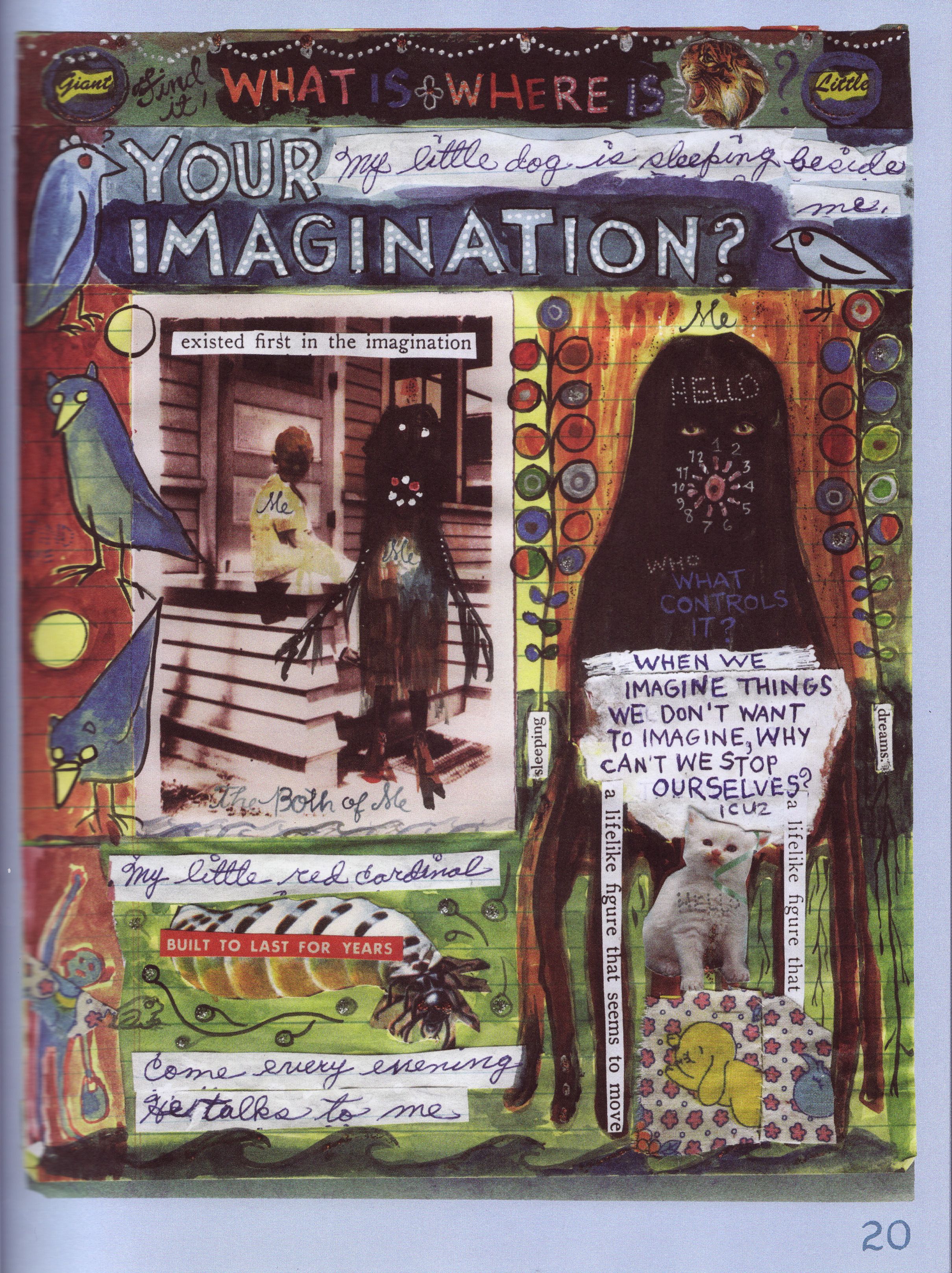
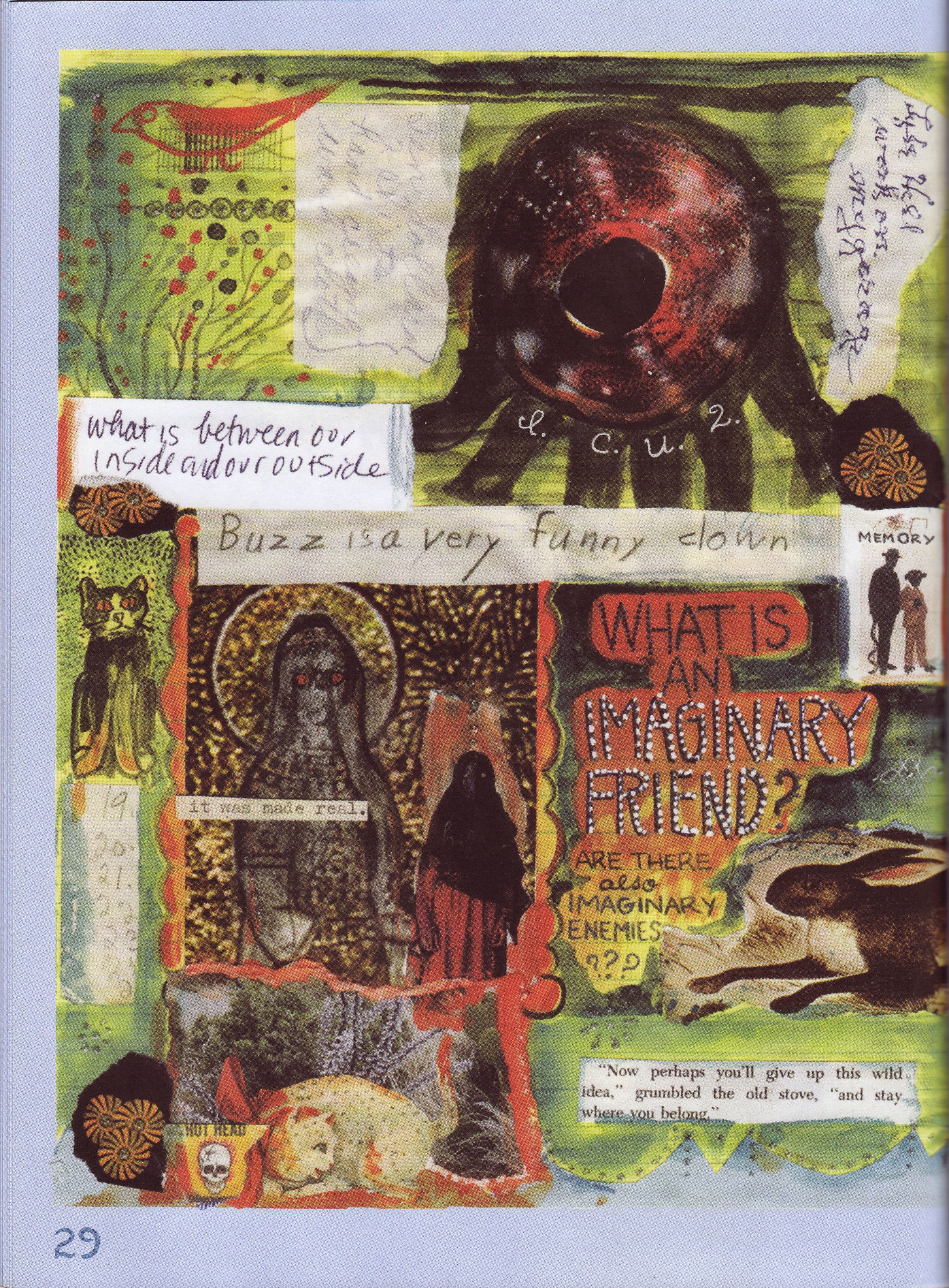
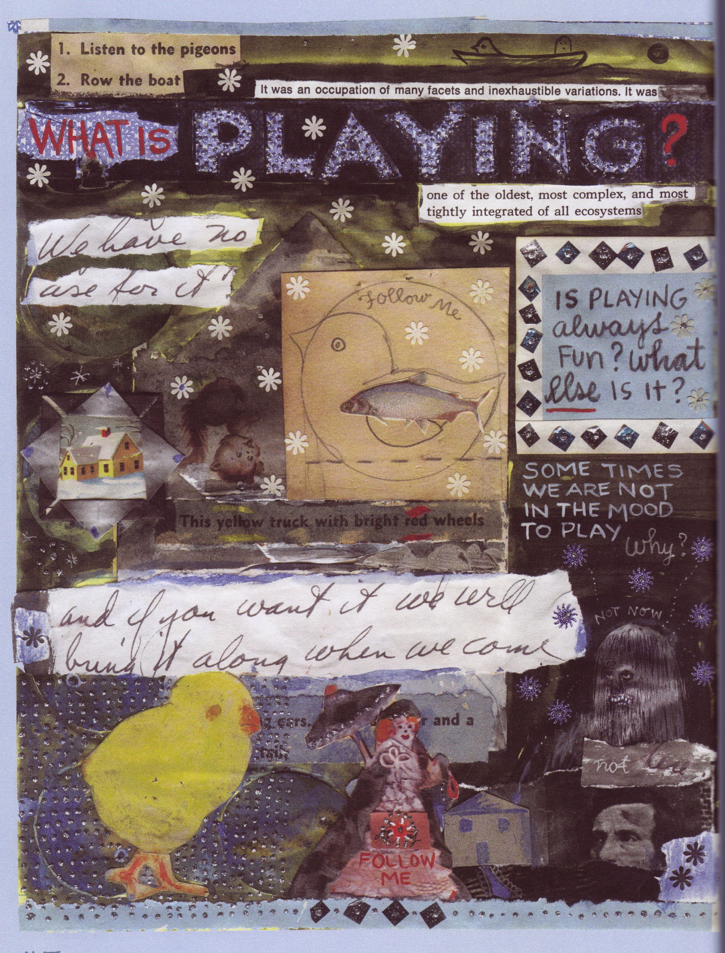
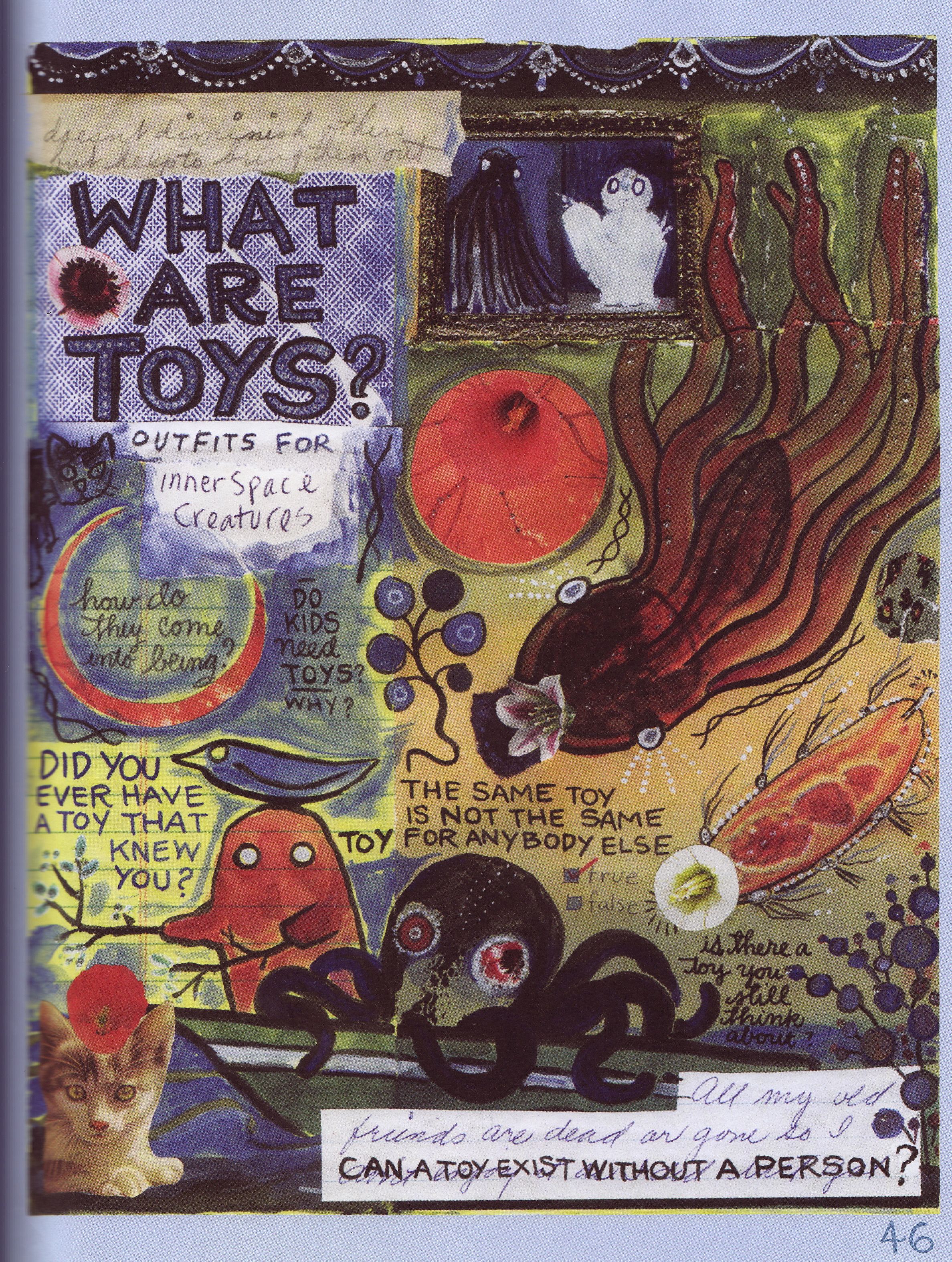
Examples of Lynda Barry-style collages below.
What are you noticing?
How does she arrange the page? What kinds of images and materials is she using? How do her images and texts meet each other?
How does she make us think?
The criteria you all generated for a successful Lynda Barry-style collage:
- asks a question
- structured: hierarchy of size
- use of mixed media (different materials)
- use of doodles to define space
- purposeful use of color
- cut and paste of texts and images
- images support words and vice versa
- use of different fonts
- use of contrast
- NOT “PERFECT”
(all images from What It Is, by Lynda Barry–Drawn and Quarterly, 2008)
