
Learn more about the 7 Basic steps to making excellent graphs
First: Check the data
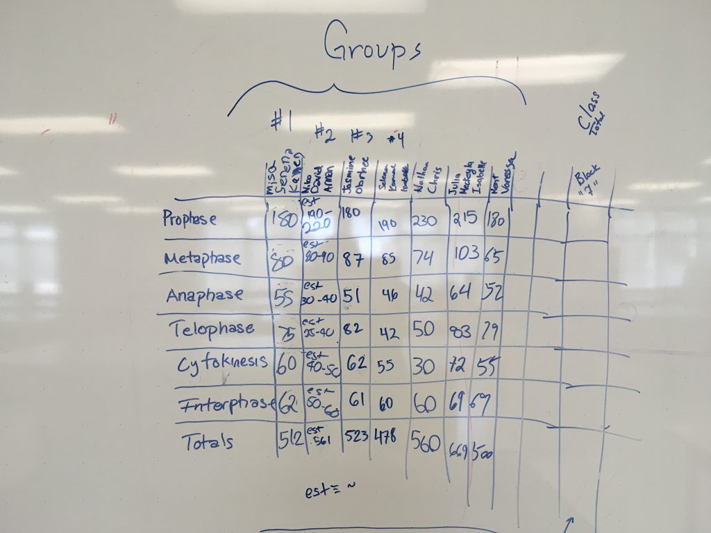
Science 10 Block 7 Class Data for graphing.

![]()
Second: Explain encodings (use a legend to help your audience understand more about how you are displaying your data).

A legend helps to explain how your data is being displayed and organized.

Third: Include Units
Fourth: Label your Axes
Fifth: Keep your geometry in check – make a graph that will fill the available space.
Sixth: Include your sources
This should go without saying. Always include where the data is from. You can put it directly in a graphic, or if it’s part of an article, the source can be specified in the copy. This does a couple of things. First, it makes your graphic more reputable, and second, those who are interested can dig deeper or fact check
Seventh: Think about your audience – make sure that your intended audience is able to understand the story of your graph.
Learn more about the SI (Metrics)